Example Datasets
Below are a number of example datasets that are derived from various different sources. They are presented in a range of supported formats and may be used to explore Graphia’s functionality.
Assorted Data
London Tube Map – Pairwise Text (.txt)
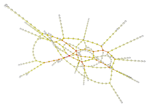
Pairwise text file using two columns to represent the London underground. The London tube map was originally designed in 1933, by electrical draughtsman Harry Beck. It is now one of the most famous network diagrams in the world. The data is presented as a connectivity map of stations and lines, represented by nodes and edges respectively.
Nutritional Food Data - Numerical Data Matrix (.csv)
It is not uncommon for laboratories to test for over a 100 different nutrients in a given food product. This is a rich source of information, and when such results are collated across many foodstuffs the amount of data becomes significant challenge to understand. Here we provide nutritional data from a wide variety of foods in a format ready for network analysis. The data comes from the UK Government’s Food Standards Agency website. After some data cleaning we have taken nutritional values for 948 foods and where available the results of 104 nutritional value scores. An analysis ready copy of these data are provided here.
UK Forename Data – Numerical Correlation Data (.csv)
In this study, Bush S.J., Powell-Smith A, Freeman TC (2018) Network analysis of the social and demographic influences on name choice within the UK (1838-2016). PLoS ONE 13(10): e0205759., researchers used network analysis to examine naming records in order to explore the influences on name choices within the UK over the last 170 years. Using a large representative sample of approximately 22 million forenames from England and Wales given between 1838 and 2014, along with a complete population sample of births registered between 1996 and 2016, they demonstrated how trends in name usage can be visualised using Graphia.
2008-2009 NASDAQ Shares – Numerical data (.csv)
Share prices rise and fall based on the performance of the company, but their value is also subject to the vagaries of the market and external forces. 2008 witnessed the now famous crash of the stock market. Sept 15th was named ‘Black Monday’ after Lehman Brothers declared bankruptcy and the Dow dropped over 500 points. Following this, market uncertainty increased and bottomed on March 5th 2009. This data set from the NASDAQ Stock Market covers the period from the beginning of 2008 until then end of 2009. It lists the end of day prices (505 in total) of 2,615 companies and therefore covers the peak period of this bear market. Visualising the correlation networks derived from these data provides a unique interface for exploring the events of a catastrophic market meltdown.
Reddit – Graphia File (.graphia)
The social media site Reddit is a global discussion forum where posts are separated into subject areas known as subreddits. This graph models each node as a subreddit with the edges indicating some form of cross-reference to another subreddit. The data was compiled by the GitHub user wojciech-graj and is available in their reddit-graph repository. Note that some of the less family friendly content has been removed from the version we present here.
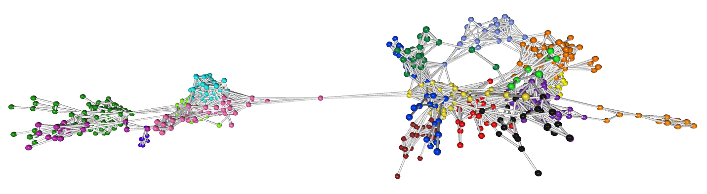
Biology
Mouse Tissue Expression Atlas – Numerical Data Matrix (.csv)
This is the dataset that started it all off. It is a microarray analysis of gene expression across 61 mouse tissues. It consists of over 36,000 measurements taken across 122 samples of embryonic and adult mouse samples. It represents one of the first ‘big’ gene expression datasets in biology and was originally published by Su et al. back in 1994 PNAS, 101: 6062. The frustrations of trying to analyse these data using conventional bioinformatics approaches were what drove us to develop the gene correlation network analysis approach incorporated into Graphia.
Mouse Gene Clusters – Weighted Pairwise Text (.txt)
A sub-graph derived from GNF mouse atlas (above) and saved as a simple weighted edge file format consisting of node-edge relationships and edge weight (3 column format). It is graph of mouse genes and their coexpression relationships to each other. The underlying data is however not saved with the graph.
Mouse Single Cell Analysis – Numerical Data Matrix (.csv)
These data describe the changing transcriptional landscape of individual cells sampled from a fertilised mouse egg (zygote) to a ball of cells (blastocyst). Whilst relatively small for single cell data (only 268 cells), it is a very well known dataset often used for training purposes and benchmarking new techniques. It also allows you to explore the potential of Graphia for analysis of single cell data. Data from: Deng Q., et al. Science 343, 193-196 (2014).
Taxonomic Tree of Mammals – Graphia File (.graphia)
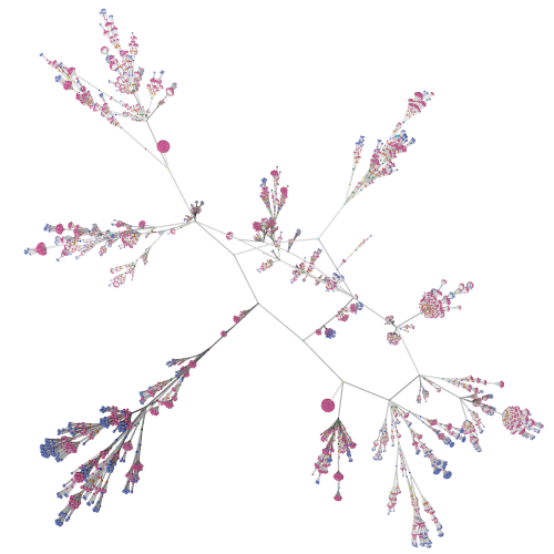
Taxonomy is the science of classifying and categorising biological organisms within structured hierarchical groups. The resulting structure of taxonomic classification is a spanning tree. Using data from the US National Center for Biotechnology Information (NCBI) Taxonomy database we have constructed a graph of mammals. Each taxonomic rank in the hierarchy is represented by a unique colour.
Geometric Graphs
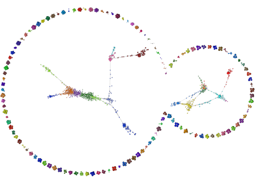
Cylinder graph – Graph Modelling Language (.gml)
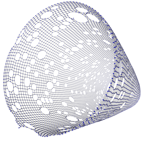
A Cylinder shape provided in .gml format with a random series of “holes” in the structure, specifically to make optimum layout difficult.
Blackhole – Pairwise Text (.txt)
A “Black hole” shape provided by a simple pairwise connection of nodes in a text file.
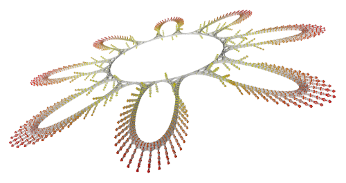
Flower – Graph Modelling Language (.gml)
A complex flower shape created in the .gml format provided by the Hachul graph set.
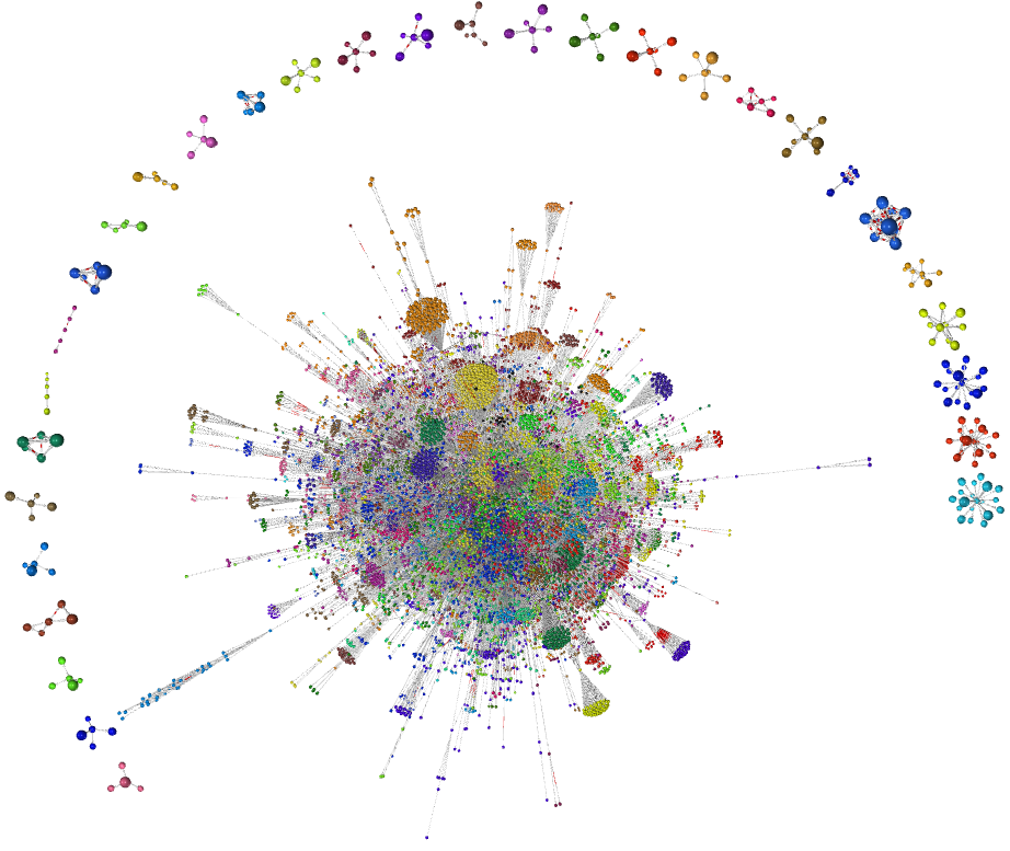
Finance256 – Graph Modelling Language (.gml)
Example graph file provided by the SuiteSparse Matrix Collection. This collection is used to test the layout capabilities of a variety of graph layout algorithms. The collection is designed to be particularly difficult for a stable optimum layout to be found. This graph is particularly large!