Enrichment Analysis
Enrichment Analysis
Enrichment analysis is often useful, especially when used in conjunction with graph clustering. Graphia provides an enrichment tool for testing your data.
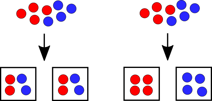
Enrichment analysis is an additional test that can be performed on sets of data to identify how significant the set distribution is compared to an average. Imagine 4 red and 4 blue balls distributed between 2 sets randomly. The statistical likelihood is that each set should get 2 red and 2 blue balls. If a bag had 4 red balls in they would be “Enriched” in red balls since it is statistically unlikely to occur by random chance. It is a useful tool for understanding how likely a result is.
With a dataset loaded, Enrichment is located under Tools → Enrichment. This will bring up the Enrichment wizard. The enrichment wizard will walk you through the steps to get started.
The first attribute you be asked to select will define the “sets” to test for enrichment. This is usually going to be a clustering, i.e. MCL or Louvain. The second attribute you will be asked to select will be the attribute value to test for enrichment. In the example above this would be the colour of the balls.
When completed, you will be shown the Enrichment Results dialog. This will display a table of results and a heat map representation of the enrichment testing on the right.
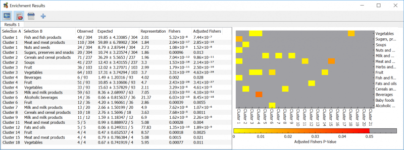
The heatmap displays the adjusted fisher’s p-value in an easy to use form. Click a heatmap result to highlight the table entry. Only statistically significant values are coloured in the heatmap, values below the standard 0.05 threshold are shown in grey. By default only the significantly enriched results are displayed in the table. To show all enrichment results, regardless of significance, click the toolbar button on the top left of the results window.