Visualisations
Visualisations
Visualisations are another important concept. Associated with nodes and edges are various attributes. This information may have been loaded from the input file, imported afterwards, or calculated in the application itself. Visualisations are often tied to the output of Transforms; for example a clustering transform will automatically apply a colour visualisation, so each cluster is coloured differently.
Clicking Add Visualisation (bottom right of graph display) will open the Add Visualisation dialog.
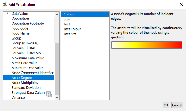
Visualisations can be one of the following types:
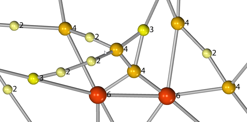
- Colour: For text based attributes this will apply a unique colour to each distinct attribute value. Numerical values will be displayed as a colour range or gradient.
- Size: This will scale elements to match the range of the attribute’s values.
- Text: This will display the attribute value as text in the graph. The visibility of graph text can be changed via View → Show Node/Edge Text. The font and size of text can be adjusted in the Options dialog.
- Text Colour: Colour the text in a similar fashion to a Colour visualisation does for nodes and edges.
- Text Size: Scale the text in a similar fashion to a Size visualisation does for nodes and edges.
- Shared Text: Where groups of nodes and edges share an attribute value, display said value next to each respective grouping.
Visualisations operate in a list, similarly to how Transforms work. Visualisations update to match the data in the graph.
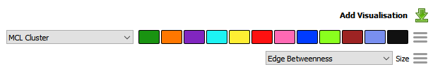
In the case of categorical attributes each attribute is assigned a colour, numerical attributes are displayed using a spectrum of colour. Clicking on the colour key of a visualisation will allow you to change the colour scheme of the whole palette or the colour assigned to individual attributes.
Each visualisation operates within its domain and does not interfere with other visualisations of a different type, for example a colour visualisation will not interfere with a text visualisation. However two visualisations of the same type will overlap, with the last visualisation in the list taking precedence. Multiple visualisations of the same type can be in the same list without overlapping, assuming they apply to separate graph elements.
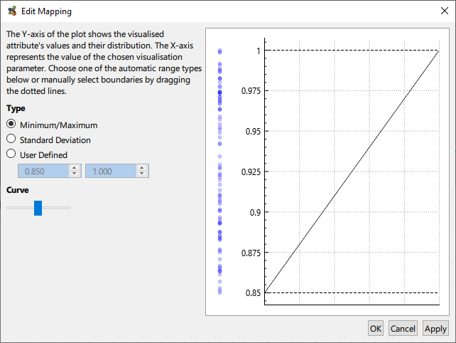
Numerical attributes can be mapped to the chosen visualisation channel in a variety of ways. By default the minimum and maximum values of the attribute are used, that is to say the minimum attribute value maps to e.g. the minimum node size, and likewise for the maxmimum. Additionally, the standard deviation may be used, or an entirely custom range decided by the user. In the case where the attribute’s value distribution is not homogenous, the curve of the mapping can be adjusted to better reflect the underlying data.