Loading Numerical Data
Numerical Data
At face value the relationship between rows of data in large tabular datasets may not be immediately obvious. Using Graphia’s built-in correlation analysis, you can identify relationships between entities based on the similarity in their data patterns. Graphia can rapidly generate correlation graphs even from very large datasets; 10s of thousands of columns and rows. The process of preparing data for loading is down to the individual, as each data type or source of data may have its own challenges in getting it ‘graph ready’. These include; data cleaning, formatting, QC, normalisation, annotation, correction, imputation, etc.. Ultimately the quality of the resulting graph visualisation depends on these steps.
In order to leverage correlation analysis, the source data must be formatted into a table either in CSV, TSV or Excel formats. These files must be structured as follows.
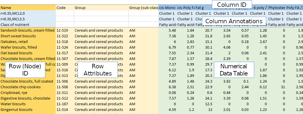
A correlation file consists of a header of column names, then a series of rows with each row representing some entity, that will ultimately correspond to a node. The first column should be a unique identifier for each of these entities (Row ID). The next set of columns should describe attribute values associated with that entity (Row Attributes). Similarly columns of data should begin with a unique identifier (Column ID), then optionally annotation data where available (Column Annotations), ending with the data values. This should be the actual data values which will be used to perform the correlation analysis (Numerical Data Table). Usually it contains numerical values, but discrete/categorical data can also be used.
Once your data is in this form, simply open the file in Graphia by navigating to File → Open or by clicking the file open toolbar button.
Generation of Correlation Graphs
A correlation matrix is notionally calculated, whereby both axes list the entities being compared, and the intersecting cells contain the correlation scores. In practice this matrix is unreasonably large and thus does not actually exist, but it can be helpful to conceptualise the process. The resulting graph is essentially equivalent to the matrix, but much easier for a human being to interpret. Most commonly the scores in the similarity matrix are calculated using the Pearson correlation coefficient, but various correlation measures are available, including those used for discrete correlation such as Jaccard.
In order to turn numerical data into a graph and identify data patterns and trends therein, Graphia compares the numerical values (data series) associated with each entity, with those associated with every other entity, in an all vs. all comparison. In other words, it makes a list of correlations ranging from -1 (perfect anti-correlation) to +1 (perfect correlation). The bigger the data series, i.e. the number of measurements it contains, the less likely any entity will be correlated to another purely by chance.
After opening a table of data, you will be presented with the correlation wizard. To set up an analysis you will be guided through a variety of options that set up the parameters for the analysis.
Data Selection
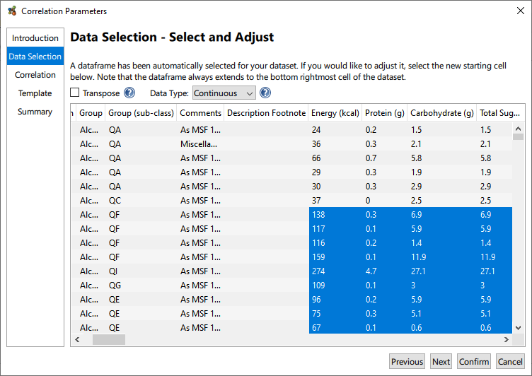
The Data Selection page contains a number of options to adjust the graph output from the file. Graphia automatically detects where the numerical data begins, i.e. the data frame (highlighted) from the input file. You can click on cells to add or remove rows and columns from the analysis if the data frame has not been identified correctly.
This page also gives you the option to transpose the data, if you wish to set the columns to be treated as nodes, instead of the rows. Additionally, the Data Type can be selected so that discrete data can be considered for correlation, i.e. that which is non-numerical.
Correlation
The distribution and number of correlation values for a given dataset is defined primarily by a number of variables:
- Number of Columns: the smaller the number, the more likely things are correlated purely by chance, i.e. you will need to select a high r-threshold value.
- Data Structure: if there are many patterns in the data it will increase the number of highly connected cliques in the data and therefore the number of edges. Also if the data describes the same or similar entities many times over, edge numbers may again be very high.
- Noise: the noisier (more random) a dataset the less it will correlate.
- Number of Rows: this directly influences the absolute number of calculations that need to be performed but not the distribution of results.
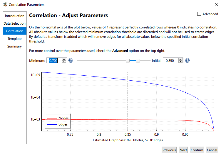
A plot of node and edge counts for a range of threshold values is provided. It should be noted that the distribution of correlation values is dataset specific and one must be aware of those node and edge counts, correlation graphs are potentially massive! Given the dataset specific nature of a correlation, it is therefore necessary to select the Minimum and Initial thresholds for graph construction.
The Minimum Threshold describes the lowest correlation value that will be used to construct a graph. This corresponds to the minimum edge weight. While Graphia calculates a full all vs. all correlation it only saves a subset the calculations as when the input files are large, the number of correlations calculated can be massive. Not only will this potentially exhaust system resources, weak correlations are generally not interesting. The default minimum threshold of 0.7 is good for many applications. For datasets consisting of weakly correlated entities you may wish to lower this value and vice versa for strongly correlated datasets.
The Initial Threshold is used to set the minimum edge weight threshold used for graph assembly. For example, using an initial threshold of 0.85 means entity pairs with a correlation score of 0.85 or above will be connected by an edge, while any relationship below 0.85 correlation will not. The Initial Threshold can be changed after the graph is generated. Clicking and dragging the dotted line will adjust the Initial threshold, or the value can be changed by entering it directly. With Initial Threshold, a good starting point is to select a value near to the “knee” of the plot; where the number of nodes begins to decrease more rapidly. Generally, the aim is to plot the maximum number of nodes connected by a minimum number of edges.
For most applications, the Pearson correlation coefficient is recommend for graphs being constructed based on all correlations above a defined threshold, however other correlation measures are available. Additionally it’s possible to build graphs of negative correlations or both negative and positive correlations, and otherwise manipulate the data being loaded. These options are available by selecting the Advanced checkbox.
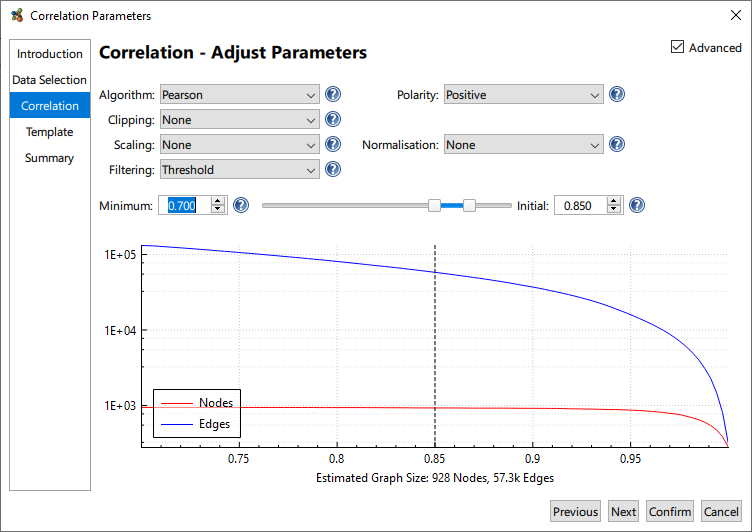
- Polarity: whether to compute anti-correlations.
- Clipping: limit the maximum value of each row according to the selected method.
- Imputation (only displayed when needed): allows the replacement of missing values in the dataset (empty cells) with a constant or interpolated value.
- Scaling: scales the values within the data frame, this is useful if you use logarithmic or exponential data.
- Normalisation: allows the adjustment of distributions of data within the data frame. Min/Max normalisation is particularly useful if the columns of data use different units.
- Filtering: the method by which edges are filtered from the graph.
Finalising
The remaining pages of the wizard include Template, which as its name suggests allows the application of predefined templates, as described previously. These transforms and visualisations can be adjusted later; allowing for their addition here is only provided as a convenience. Finally, a summary page is presented, which documents the parameters that will be used to create the graph. This can be accessed later by going to the Tools menu and choosing Show Provenance Log….
Please note, should your selected settings for graph construction result in a large graph, the following message will be displayed:
‘WARNING: This is a very large graph which has the potential to exhaust system resources and lead to instability or freezes. Increasing the Minimum Correlation Value will usually reduce the graph size.’
Ignore this warning at your peril!
Clicking Finish begins the computation of the graph using the selecting settings. Clicking Confirm at any point when using the wizard will skip to the Summary page using the current settings.
Importing Column Annotations
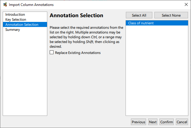
Having performed a correlation, it may be desirable to superimpose some external meta data onto the graph as column annotations. This facility is available via the Plot → Import Annotations From Table… menu option. The table in question should be constructed as a simple row wise list of annotation values, with the first column providing names for the annotations. In particular, the first row needs to be a key that it used to map data columns to annotation values.
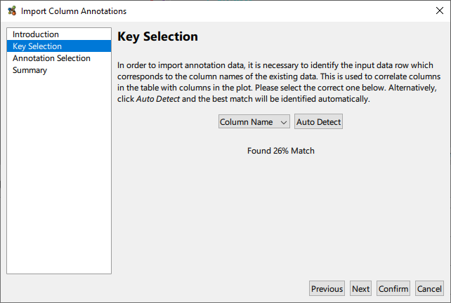
Once the key mapping is detected or selected, it only remains to select which annotation(s) to import from the table.