Correlation Analysis Steps
Correlation Analysis
From here on you may require many of Graphia’s visualisation and analytical capabilities described in the previous section. In particular you may wish to:
- Adjust the correlation threshold. Displayed at top right hand corner of the screen is a slider bar and text box for adjusting the display threshold between the minimum threshold and 1.
- Cluster the graph, if a clustering transform was not selected in the wizard.
- Display the data values associated with clusters - see below.
Correlation Graph - First view
Edges are created for any relationships with a correlation value above the minimum threshold, however only those edges with a value above the defined initial threshold will be displayed. This value is adjustable in the transform list.
![]()
There are two transforms automatically added to the transforms list. The first, Remove Edges where Pearson Correlation Value < [Initial Threshold], will remove all edges with a correlation score below the value set. This value can be adjusted here and its effects will be immediately applied to the graph. A large value will remove all but the most highly correlated relationships while a low value will display the weaker relationships. The second, Remove Components where Component Size ≤ 1, will remove singular nodes from the display that have no connections.
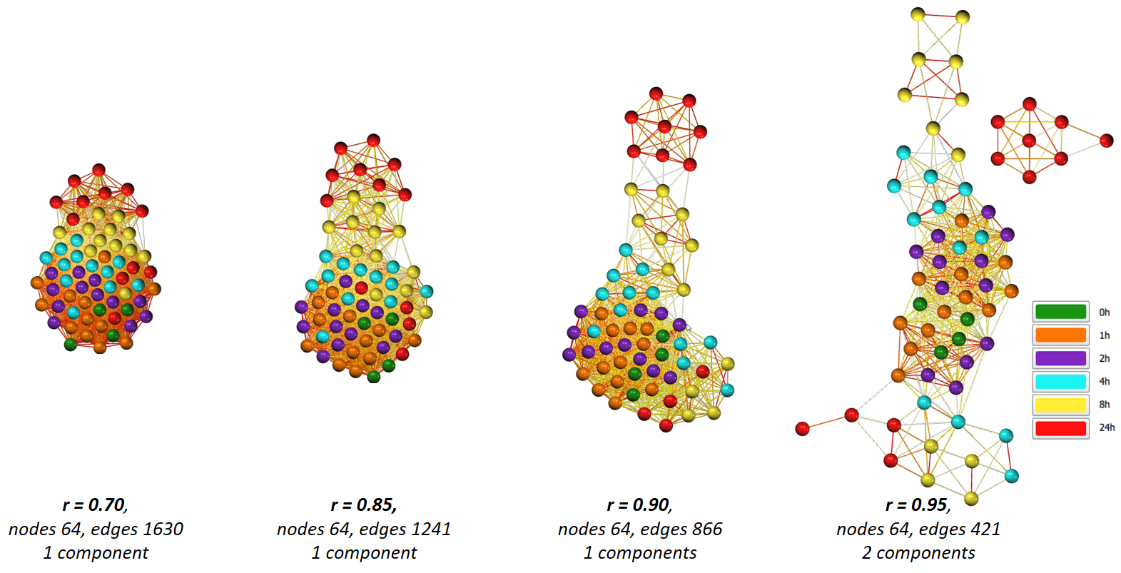
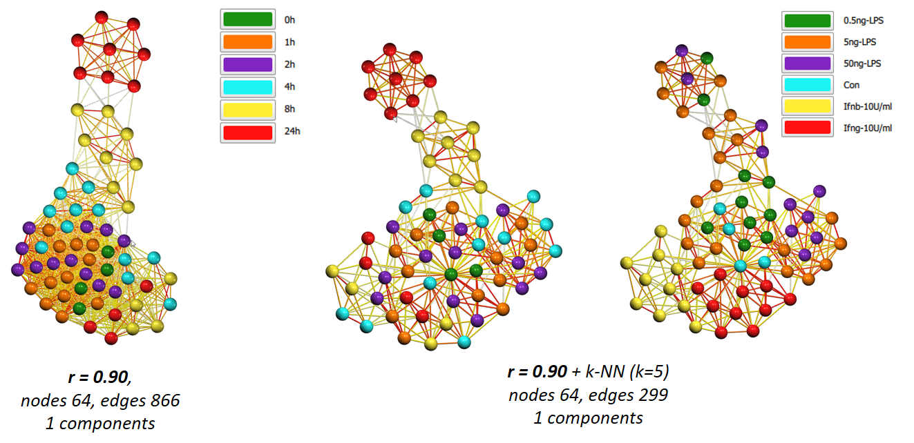
By adjusting the cut-off value for edges, you can ‘open up’ the graph to reveal underlying structure - what connects, and where the nodes are relative to others. Another option to help reveal the structure of a highly connected graph is to apply an edge reduction method such as k-NN. Below shows the above graph before and after the k-NN edge reduction algorithm has been applied.
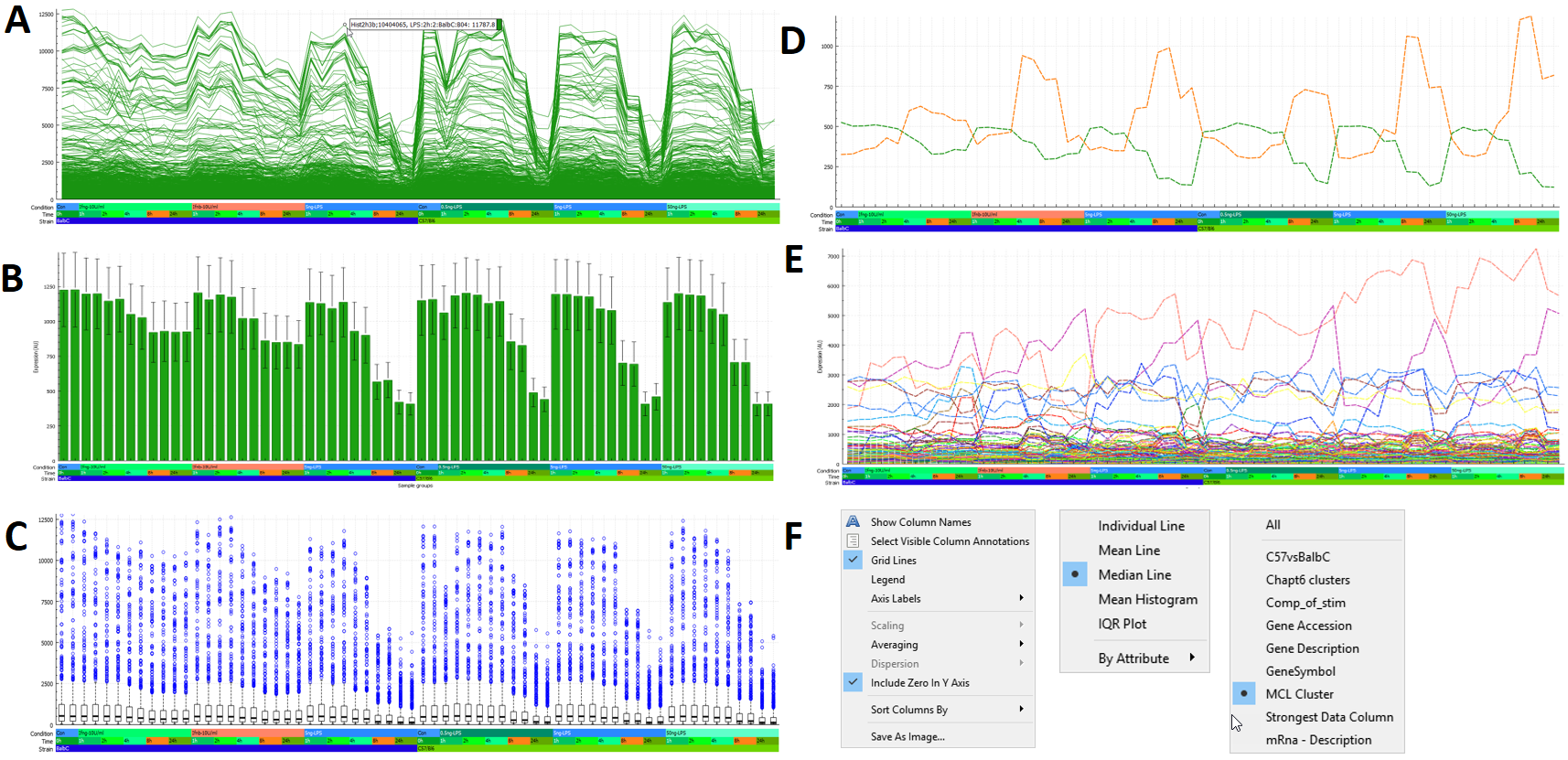
Data Plot
When performing a correlation analysis, a data plot is also displayed adjacent to the usual attribute table. This plot displays the data values associated with selected nodes. There are numerous options to change the appearance of this plot, these are discussed below.
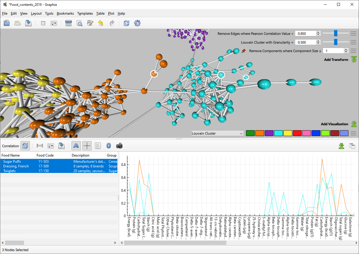
Cluster Analysis
Once a correlation graph has been generated, a common first step is to run a clustering algorithm. This partitions the graph into clusters based on the connectivity between nodes, with the result that entities with a similar data profile are located within the same cluster. For correlation graphs where the average node degree is high, we recommend the use of the MCL algorithm. The granularity setting for clustering can be adjusted on fly by use of the slider bar, such that the clustering reflects the visible graph structure. Once satisfied with the partition of a graph, a user can then rapidly explore the profile of the resulting clusters.
Go to Edit → Find by Attribute Value and the following user interface will appear in the top left of the window. This allows finding all the nodes which have a particular value for the selected attribute. In the context of clustering, this allows the user to scroll through the calculated clusters. Multiple clusters can be selected at once using the option immediately to the right of the attribute selector; Select Multiple.
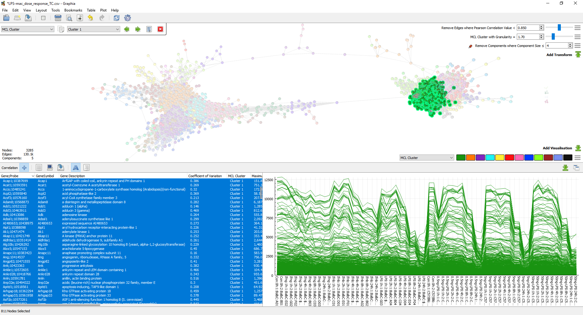
The data profile of the selected nodes is displayed in the lower right of the window. There are numerous options available to control this, examples of which are shown here:
Graphia is designed to let a user quickly explore data clusters, defining what is interesting and what is ‘noise’. Having selected a specific cluster, individual data points within that cluster may be selected in the attribute table. By scrolling up and down within the data table, individual nodes are highlighted, and their data profiles displayed in the plot. After an initial analysis it may be necessary to look again at the input data, possibly recalculating values or removing data that is not of interest, therefore focusing an analysis on what is interesting.
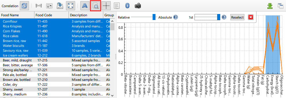
Find Rows of Interest
When examining correlation data, sometimes it is helpful to be able to isolate the graph nodes that correspond to distinct columns in the source data set. This is the purpose of the Find Rows of Interest function. After enabling said function, one or more columns in the data plot must be selected. Thereafter, any node selection will have its corresponsing data row selection reduced such that only the top most rows are shown in the data plot. The number of highlighted rows can be changed by adjusting the Percentile slider. The nature of the selection is also mutable via the Selection Weighting slider. Broadly speaking, this allows for finding either rows that have peaks in the selected columns (denoted Absoute) or for finding rows that have significant values specifically in the selected columns (denoted Relative). Note that columns can also be selected via Column Annotation.